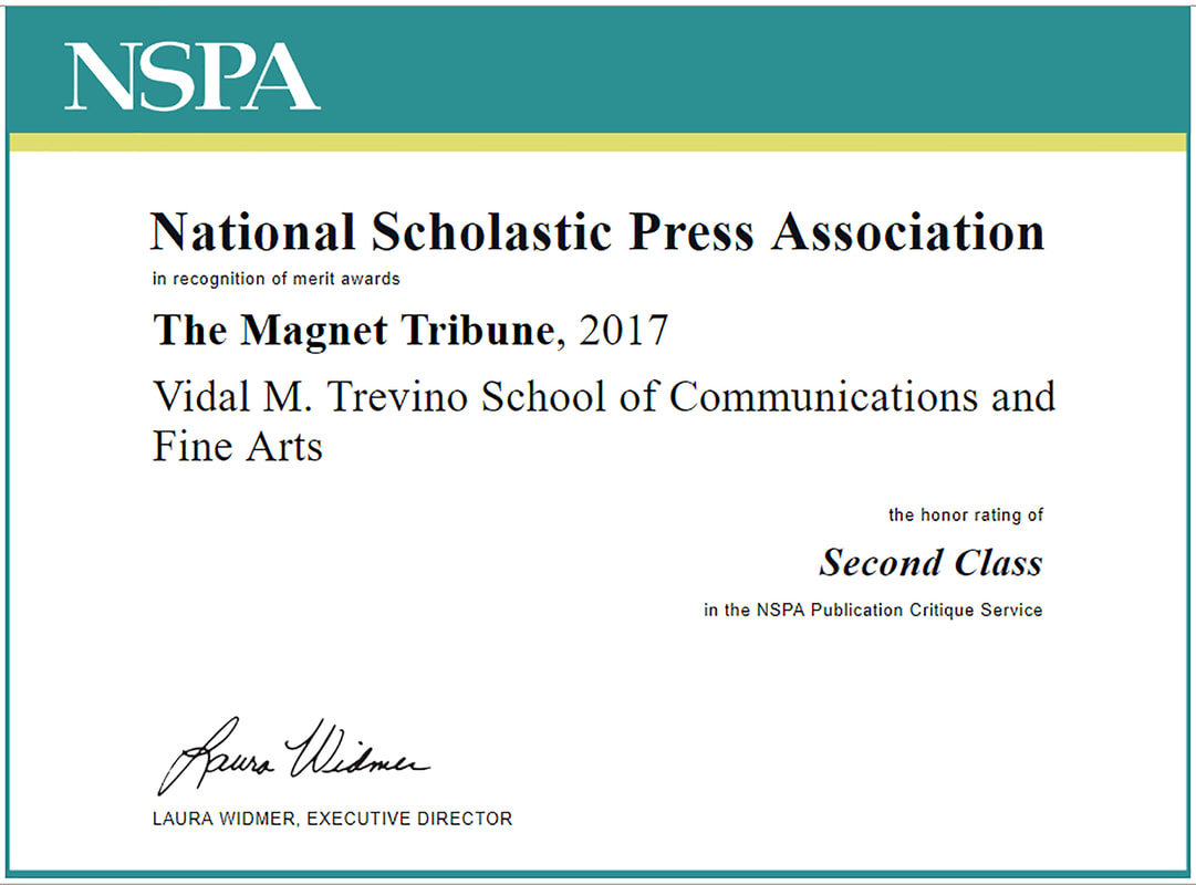
National Scholastic Press Association print newspaper evaluation
Second Class Award for print newspapers in 2017-2018.
To see judge's annotations, please download the files below.
| jan_2017_judges_annotations.pdf |
| may_2017_judges_annotationsa.pdf |
Part 1: Coverage and Content
Strengths: You had a number of commentary/opinion stories that were pretty good. The review page was also quote good. Keep that going. I was happy to see a solid editorial that took a stance. It was lacking some needed elements, but that you had one was excellent. Some of the graphics were solid. Work on creating good info graphics to support your writing. I didn't see anything that would indicate you weren't following good ethics and press law. I did see lots of links to your website and social media accounts. This was good and I am happy.
Recommendations: As a bi-yearly product you are in a tough situation when it comes to news coverage as it is very hard to be timely with most things. One thing you might do to help with this is to create a more feature-based publication. This is becoming more trendy across the board, even in papers that come out more frequently. Instead of trying to meet the news peg, which hopefully you are covering this kind of stuff on your website. Visually your paper is weak. Nearly every photo was posed and there were lots of big grop shots. Other visual pieces were taken from outside sources or were just so small they didn't help the story/page. This is an area of your paper you should really work hard on. You have zero sports coverage for a reason, but you are also lacking coverage of your fine arts department. I just didn't see enough coverage of your theater, music, etc...departments. Some of your opinions were columns that had very little direct impact on your students, it was only there to serve your writers.
Total points: 130/200
Part 2: Text
Strengths: I felt that your editing was good in terms of actual sentence structure. It is clear that your writers are concerned about their stories and are trying to get the correct information out to the reader. I don't think that anything you are doing wrong is intentional, you just need some direction and consistency. Headlines were decent in the January edition, but became more labels in the later edition.
Recommendations: This is the second area you need to work carefully on. Your paper is not to standard with your style, stick to quote-transition style consistently. There should never be stacked quotes or stacked transitions. Work on your sourcing. You should be interviewing at least 5-6 people for each story and directly quoting at least three per story. Get the voices of your students in the paper. Work on your AP style, especially numbers and dates. Your attributions are often incorrect. Leads are weak and often date driven. Work hard to write "visual leads" followed by a strong nut Graf and then a quote. There was editorializing in news pieces across both papers. You have lots of leading transitions meaning you basically tell your readers what they are going to read in the following quote. Work on those. Your quotes are often fact-based and should be based in feelings and emotions.
Total points: 60/100
Part 3: Visuals
Strengths: Your photos are mostly crisp and clean. I found some that had a nice human interest even though they were posed. There were some nice infographics in your second paper. I appreciated your efforts there. I also liked the few illustrations I saw. The photos that were more candid were pretty good. Make sure you get faces - those are crucial. I think this was probably your biggest weakness in your product. I know we are supposed to make five positive comments here, but when I look at the guide above, I struggle to find areas that you are executing. This is a glaring problem. More candids please!!
Recommendations: This is the other area your paper needs to work on the most. Start with writing, start working on style first and then work on the rest. In photography you should concentrate on getting candid moments. In most cases you could certainly have gotten these done for nearly every story. Some of your candid images were soft on your main subject meaning they were slightly out of focus. Work hard to make sure your photos are crisp and sharp. There were few graphics and some were just simple drawings. Try to work on your infographic creation. Come up with art that has a message or art that has information that contributes to your stories.
Total points: 50/100
Part 4: Presentation
Strengths: Your front page was solid. I liked the flag and teasers. It was a nice clean page. Inside pages looked very similar with stories stacked on each other. Try to vary your design so you have some vertical based pieces, there are plenty of design styles out there to model. Look at other papers for examples. I didn't think your paper was difficult to read, so your topography is fine. I would suggest shifting away from centered headlines if you remain a broadsheet. I would look at your captions, the by line should be smaller than the caption font. I also feel like your story by lines could be more creative with a box or a line to help separate them from the body copy. The double truck was very sharp in both papers. I do think you should include a larger story or perhaps a second story especially if the majority of your photos are going to be group and posed shots. Folios were solid.
Recommendations: You varied from your grid a few times in each paper. Work hard to remain modular and keep your grid consistent. Try to match your masthead/staff box to your flag, this is a nice technique and looks good. I feel like your design is pretty stagnant on inside pages. Try to find examples of different designs so you aren't just stacking story after story. Inside your modules on individual pages you did have some creativity and I did see lots of variation there.
Total points: 70/100
Part 5: Online/Social Media
Please award up to 10 bonus points for active social media accounts that complement the print publication.
Points: 10 of 10 bonus points possible
Points: 10 of 10 bonus points possible
Summary
So remember I am just one person critiquing your paper. You may do many things for a reason and in that case, keep doing what you need to for your students. I do think there are two big areas for you to improve. Your writing needs to adhere to current conventions, meaning quote-transition style. Your photography also needs work. You need less posed photos and more candids. You can't make those changes all in one swoop, but if you pick one aspect and concentrate on that for a period of time, then shift to another area, eventually you will discover that everything starts coming together. See my comments on the pdfs I marked up and look at my comments in this guide. Good luck next year and have a great summer. Also, I wanted to apologize for how long this took. I should have had this to you at least a month ago. I am sorry it took me so long.
Score:
Marks of Distinction: -0-
Honor Rating: Second Class
Judge: Michael Reeves
Score:
- Coverage & Content: 130
- Text: 60
- Visuals: 50
- Presentation: 70
- Online/Social Media : 10
Marks of Distinction: -0-
Honor Rating: Second Class
Judge: Michael Reeves
